

Contemporary design is not only about beauty but also about clarity, functionality, and usability. Regardless of whether you are doing web, print, branding, or interiors, there are a couple of tricks that can be selected to enhance your work, make it more efficient and effective, and be remembered in the middle of the market. These 10 design hacks are centered on layout, color, typography and user-centered thinking, providing you with practical tools that you can use immediately.
1. Embrace Negative Space
It is called negative space, or white space, the space between and surrounding elements. Modern designers do not fill all the corners, but rather create breathing space as part of the design to direct attention and emphasize significant information. Less layouts and wide spacing can be so clean, sophisticated and easier to read. Excess clutter is distracting, excess whiteness will bring the eye precisely where you desire it to be.
2. Use a Clear Visual Hierarchy
The visual hierarchy is what is first perceived by the eye. Ensure this hierarchy is evident by size, color, weight and position. Critical details, including headings, calls to action or major images, must be larger, bolder or located in focus points like the top-left part. The secondary information may be smaller or lighter. Good hierarchy enhances understanding and maintains the audience instead of being bewildered.
3. Stick to a Limited Color Palette
The designs are cohesive and professional due to a narrowed color palette. Keep your palette to a small number of primary colors one primary color, one or two accents and a neutral base color, like white, gray, or off-white. Highlight what is important using color and do not bombard the viewers with a variety of colors. Contemporary design tends to lean towards a more subdued or pastel color scheme, yet contrast remains crucial to readability and accessibility.
4. Prioritize Readable Typography
Layout is as important as the fonts. Select straightforward typefaces, have a distinct contrast of text and background, and do not use very thin or ornamental typefaces in the body. Use two or three fonts within each project, one font to be used in headings, one in the body and maybe one in accents. Adequate line height, letter spacing and alignment also influence legibility, particularly on screens.
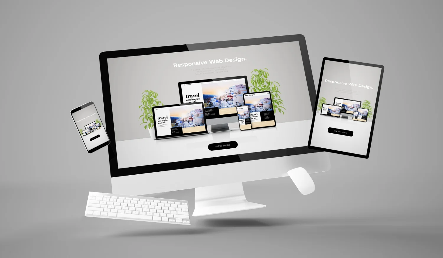
5. Design for Multiple Devices
The new designs in a mobile-first world have to be compatible with phones, tablets, and desktops. Apply responsive layouts, flexible grids, and scalable elements that can change in a gentle manner to suit varying screen sizes. Whenever you can test your work on real devices, as what may look good on a laptop may not work on a small phone. Multiple device design is not an advantage; it is a necessity.
6. Maintain Consistent Style and Branding
Consistency builds trust. Apply the same colors, fonts, spacing, and type of icons used in a project or brand. Repeat visual information, e.g. shape of a button, corner radius, and weight of a line, to make the users feel oriented. A powerful, consistent design also renders branding to be memorable, be it a site, application or an advertising medium.
7. Add Micro‑Interactions and Subtle Animations
Digital experiences are made more lively and responsive by small interactive elements, such as hover effects, clickable buttons, smooth transitions, and loading animations. Modern design uses micro‑interactions to guide users, provide feedback, and add delight without distracting from the main content. Avoid over‑animation, but don’t ignore movement either; a well‑timed transition can make a user feel in control and guided.
8. Use Grids and Alignment for Structure
Layouts are arranged and balanced by grids. A grid system is a way to bring order and alignment to a work piece, whether it is in print or digital, and enhance the flow of visual components. Things that fit together are purposeful; things that are randomly placed are disorderly. The layouts of the modern era are anchored by a powerful grid, with regular margins and spacing.
9. Design for Accessibility and Inclusivity
Good design is to the good. Select contrasting color schemes, readable fonts, and understandable icons. Have alternative text to images, logical navigation and readable button labels. Contemporary designers are conscious of individuals with various visual impairments, languages and gadgets. Good design does not consider accessibility as an afterthought.
10. Test, Iterate, and Refine
There is no design that is flawless. Contemporary designers revisit, experiment and refine their work. Request feedback, do usability tests, and observe the interaction between the real users and your designs. Make little, specific adjustments, not a fresh start. The process of iteration transforms good ideas into great experiences and makes the design process flexible and user-centered.


