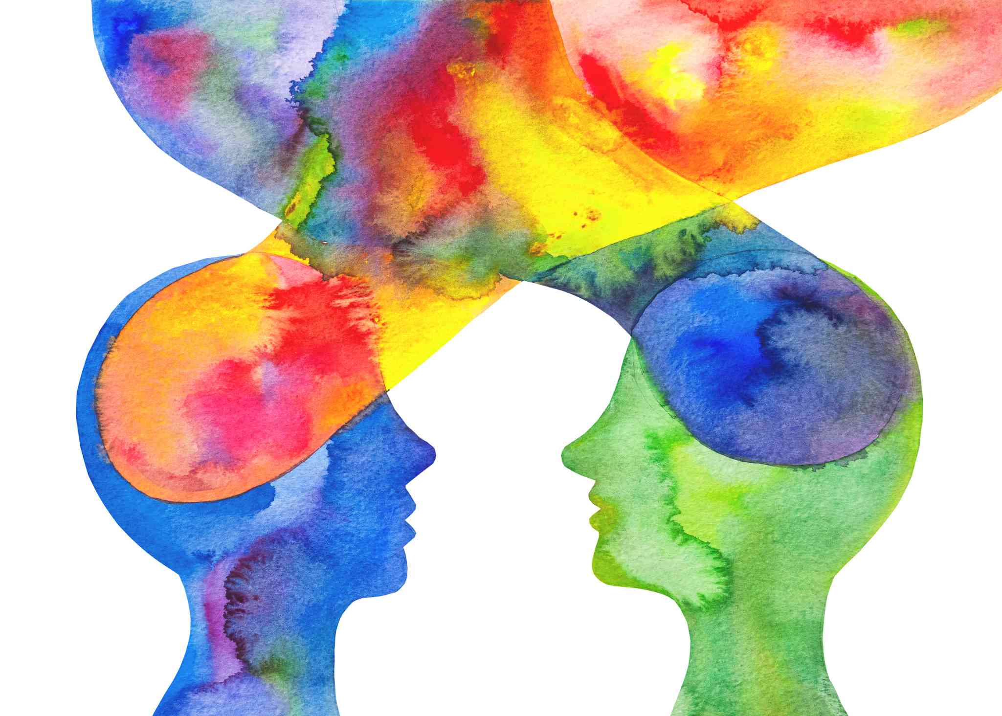
Color is one of the weapons of design that acts without saying, creating impacts on emotions, attitudes and choices. Whereas layout and typography influence the way individuals read, color influences how they feel prior to seeing the details. Color can be used deliberately to make a brand trustworthy, a site serene, or a product exhilarating. The psychology of basic colors can guide designers to transform images into messages that can actually resonate with the audience.
1. Understand the Emotional Impact of Colors
Various colors evoke various psychological reactions and these are usually influenced by culture, experience, and context. In most Western cultures, such as blue, is linked to trust, reliability, and professionalism, and this is why it can be seen everywhere in the banking, healthcare, and technology branding. Red tends to be energizing, urgent or passionate and is good in calls to action, sale labels and bold statements. Yellow will be optimistic and friendly, but overwhelming when used excessively, whereas green is associated with growth, nature, and safety. Black may be luxurious or serious, and white may most frequently imply simplicity, cleanliness, and openness. Designers ought to select colors that are related to the mood they are trying to evoke rather than selecting colors that are fashionable.
2. Use Color to Build Brand Identity
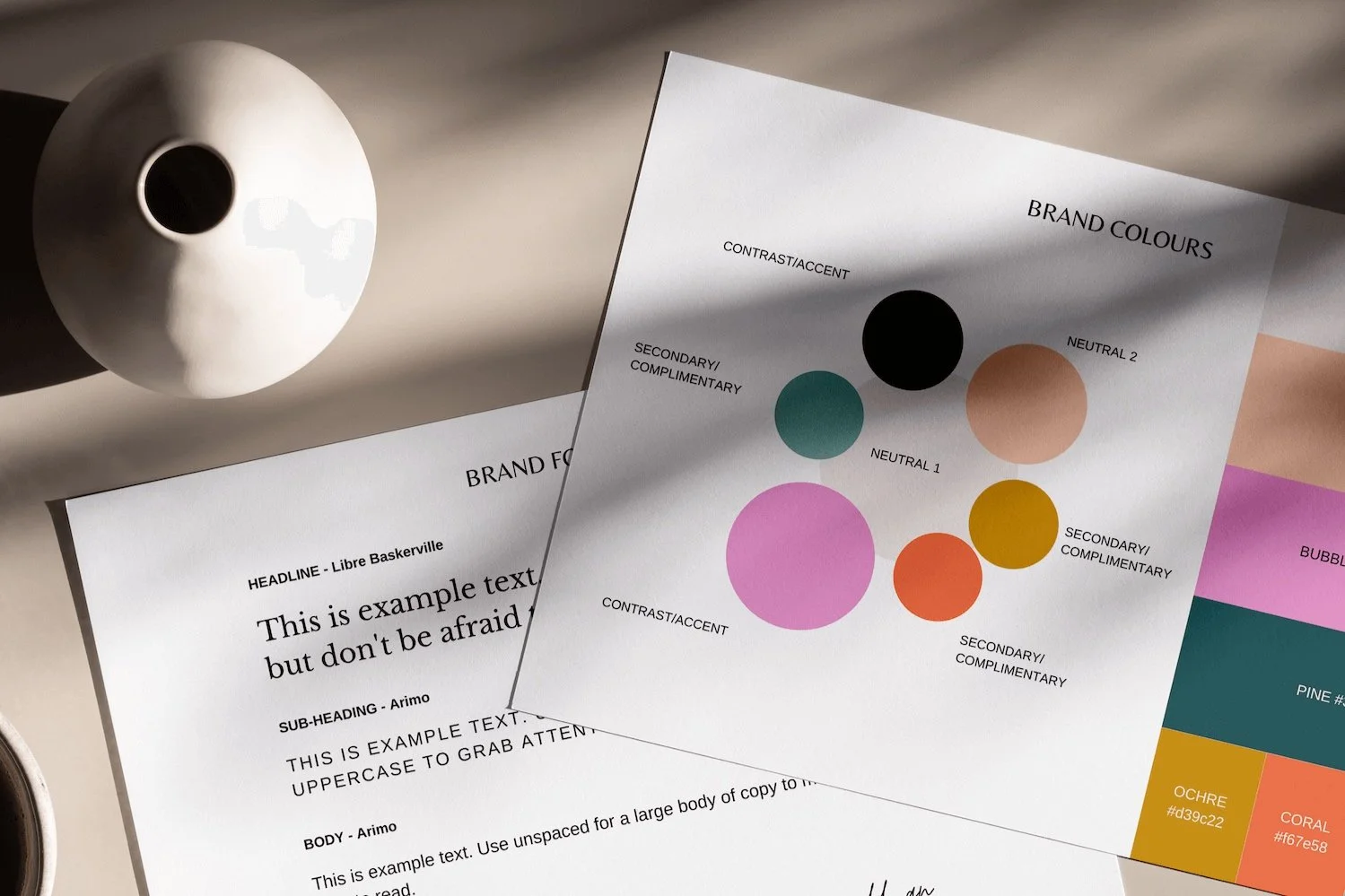
The personality of a brand includes its color palette. Regular use of certain colors in logos, websites, packaging, and marketing materials creates a sense of recognition and trust. Firms such as Coca-Cola, Facebook and Starbucks have established good associations between their brands and their colors. When creating a brand, keep it to a small number of colors and make every color purposeful. The colors may be friendly and inviting with warm colors or calm and stable with cool colors. Delicate color differences, including tints and shades, result in the palette being flexible without becoming inconsistent.
3. Guide Attention with Contrast and Emphasis
Color can direct the eye through a design. Bright or vivid colors are inherently attention grabbing and thus they are good with buttons, headlines or significant information. Subdued or dull colors may be pushed in the background, allowing prominent features to shine through. Dark text against a light background makes reading easier, whereas light text against dark implies a subtle, sophisticated appearance which is suitable in some moods. Clearly, smart designers employ color contrast to bring out what is important and make interfaces and layouts simple and easy to use.
4. Match Color Choices to the Audience and Context
The psychology of colors is not universal; it is a matter of audience, culture and circumstance. What is a positive color in one context can be inappropriate in another. To illustrate, neon colors could be viewed as a potential source of energy to a youth-oriented brand, but they would be unprofessional in the case of a law firm or a medical service. Designers need to take into account the viewers of the work and their contacts with it. Cases of bright and playful colors in children products, educational content might be more inclined towards a calm and clear tone, and luxury brands might be inclined towards dark and rich palettes. The context is as important as the color itself.
5. Avoid Overuse and Visual Fatigue
The fact that color can talk does not imply that all the elements have to scream. Excessive colors together may be too much and may disorient and fatigue the eye. Single or two primary colors with a supporting array of neutrals is more effective than a rainbow of unrelated colors. In case of uncertainty, it is better to begin with a few colors and then add on what is required. Minor changes, balanced patterns, and muted accent tones can render a design to be mature, deliberate, and memorable.
When treated as a language, rather than as a decoration, color can enable designers to make their work speak clearly, emotionally, and powerfully. When color, form and content are in harmony, the design is not merely good-looking, but it talks.